- Air Homepage
- Weather Satellites
- Earth Photo Satellite
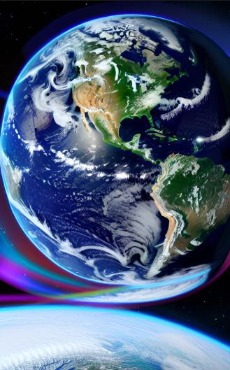
Understanding earth photo satellite Images and Demystifying weather photos
Suppose you just saw an earth photo satellite image for the first time.
Satellite Weather Image Enhancement: A Guide - The dull gray satellite photo of the Earth hides a wealth of color and detail that shows the exact temperature of a thunderstorm cloud. You can pinpoint storm systems and discover hidden atmospheric secrets by using secret enhancement techniques like histogram equalization that meteorologists use to sharpen the contrast of these weather photos.
Find more about weather satellites.
Learn how to interpret weather satellite images without a meteorology background. Discover how to enhance these images for better clarity and insight into weather patterns.
What's up with the light and dark areas, the monotony, and the dull shades of grey? Or moving gray patches in a satellite photo? It would be more obvious if you increased the contrast in the photo.
For people without a meteorology background, reading and interpreting weather satellite photos can be tough. Without proper training and experience, the images can be confusing. Satellite photos can, however, be analyzed by anyone with some basic knowledge and understanding.
Online resources can help people interpret satellite images. You can learn how to read satellite images and interpret weather patterns from the National Oceanic and Atmospheric Administration (NOAA).
Satellite images can show cloud formations, weather systems, and atmospheric conditions like humidity and temperature. Compare images from different times to see how weather patterns change.
Satellite images are just one tool meteorologists use to predict weather patterns. Other factors like ground observations, radar data, and computer models are also taken into account. While satellite images can be helpful, they're not the only way to understand weather.
The technology behind weather satellite photos
What's the best way to get good contrast on satellite images? Satellite images are enhanced using a number of techniques to make them easier to read. I'll give you a few examples:
- Satellite images can be enhanced with image filters to highlight certain features. You can use a high-pass filter to accentuate edges and boundaries in an image, and a low-pass filter to blur and smooth it out. You can apply filters to satellite images to emphasize certain features or reduce noise.
- Changing the color map of an image can make certain features stand out more. If you use a blue-green color map, you can highlight areas with high moisture content, and if you use a red-yellow color map, you can highlight areas with high temperature. Certain features of an image can stand out more clearly when the color mapping is changed.
- Meteorologists often use compositing to combine multiple satellite images into a single, more detailed image. To create a composite image, they might use a visible light image for the land and a thermal infrared image for the clouds. This technique combines multiple satellite images into one, more detailed one.
- Adapting satellite images for lighting and weather can be done by calibrating them. Image clarity can be improved by reducing noise.
- A satellite image can be enhanced with annotations to provide context and make certain features easier to identify. Wind patterns can be highlighted with arrows and lines, while specific weather systems can be identified with labels.
- The histogram equalization technique redistributes pixel values in an image to improve contrast. You can equalize histograms for individual channels or for the whole image.
- Contrast stretching: This technique improves visibility by adjusting brightness and contrast. An image is stretched so that the darkest and lightest pixels are farther apart.
- Sharpening an image makes it look sharper and more detailed by enhancing the edges. You can do it with specialized algorithms, like unsharp masking or Laplacian filtering.
I can see clearly now
Satellite photos used to be black, white, and gray in the early days. I'll start with the techniques we had for handling the images. Around 40 shades of grey can be separated by our eyes. There are over 200 satellites, most of which mark divisions that meteorologists don't really care about.
By sharpening the contrasts within the temperatures of concern shown in the image, meteorologists could read details like temperature changes. In histogram equalization, for example, the minimum and maximum temperatures currently under consideration are identified, and then all values are re-distributed.
Infrared satellite displays are often used by forecasters. Such a display maps a gray shade to a small temperature range, and the reader would manually add color for clarity.
It would be more useful if we were to use a limited number of greyshades to highlight important data. If you had the right software, you could customize this earth photo satellite product to your needs. And then assign a specific brightness to a narrow range of temperatures or radiation intensities.
Control image enhancement is what meteorologists call it, and we can compare it to the gamma correction example in the photo strip on the right. Gamma correction adjusts brightness and contrast in an image. In addition to making colors look more natural, it also makes subtle details more visible.
The two adjustments achieve similar purposes; a control image enhancement technique also adjusts a photo's contrast, brightness, and sharpness. This makes a photo look more vivid and detailed, so it's more visually appealing. It could be applied to color and black-and-white images, which is what weather satellite photos were back then.
An earth photo satellite
Here's an example. What's the point of a black to white scale with evenly divided temperature/grey increments from minus 150°F to over 130°F? That's what the photo spectrum covers. Realistically, we're only looking at a range spanning 50 to 100 degrees from the ground to the top of the clouds, not the full 280.
It's possible for the earth-atmosphere system to experience these extremes occasionally. We don't see them often, and certainly not in one small geographical area at a single time.
Suppose you're a meteorologist for an area where temperatures are always between 10° and 80° this time of year. Set those 40 or so levels to cover that temperature range and tuck away the unneeded temperature increments into a small range of greys?
Now you have a custom enhanced satellite image that fits your needs. Your relevant temperature range is covered.
#5
Search this site for more information now.
You might see special results at the top of the page, above the word WEB. They're ads, but they might be important to you. Happy searching!
Advanced techniques
One trick you can use is to cycle through the entire grey-scale twice in one earth photo satellite illustration. A cumulonimbus, for example, is a tall thunderstorm cloud where we want good detail over an extended temperature range (where cloud temperatures correspond to elevation).
With modern technology, we can use different colors instead of just grey. A multispectral composite can also be created by overlaying different types of earth photo satellite images. We'll continue to see great developments in earth photo satellite interpretation in the future.
There's a scale of shades or colors on the side of the image showing what temperature range each shade corresponds to. You can convert brilliance level to temperature with it.
As you have seen, there are a few ways meteorologists boost contrast on satellite images. Using these techniques, they can create images that are easier to interpret and provide more useful information about weather patterns.
Meteorologists use several image enhancement techniques to improve contrast and make satellite images easier to read, including these ones presented above. With these and other image enhancement techniques, meteorologists can improve contrast and reveal more details in satellite images, making them easier to interpret and offering valuable insights into weather patterns.
Satellite imagery of the Earth using shades of gray
Satellite imagery shows us meaningful tones and colors on the earth. Moreover, they correspond to varying air quality characteristics.
Do you have concerns about air pollution in your area??
Perhaps modelling air pollution will provide the answers to your question.
That is what I do on a full-time basis. Find out if it is necessary for your project.
Have your Say...
on the StuffintheAir facebook page
Other topics listed in these guides:
The Stuff-in-the-Air Site Map
And,
Thank you to my research and writing assistants, ChatGPT and WordTune, as well as Wombo and others for the images.
OpenAI's large-scale language generation model (and others provided by Google and Meta), helped generate this text. As soon as draft language is generated, the author reviews, edits, and revises it to their own liking and is responsible for the content.


New! Comments
Do you like what you see here? Please let us know in the box below.