wind diagrams
by Kelvin
(Lagos - Nigeria)


Wind Rose Example
HOW DO ONE DRAW A WIND ROS AND what is the function of these wind diagrams?
Barry's Response - Kelvin:
Want to learn more about the intricate patterns of wind movement? Learn about wind patterns and climate with windrose diagrams.
Discover how to create and interpret windrose diagrams
...a powerful tool used by meteorologists, environmental scientists, and outdoor enthusiasts. Discover how wind direction, speed, and frequency affect our environment.
Discover the art of windrose creation and unleash your analytical skills. Discover hidden patterns in wind behavior and use this knowledge for everything from renewable energy to urban planning.
You'll learn what shapes our weather systems and climate with these diagrams. Explore the world of meteorology and visualize wind data. Discover the secrets of wind patterns as you unleash your creativity.
Learn this valuable skill and become a wind whisperer. No matter what your interests are, learning how to make and read wind diagrams will open up a whole new world of insights and discoveries.
Don't miss out on this captivating journey!
At a glance, this statistical plot shows climate wind speed and direction. Using a compass-style plot, wind roses show a breakdown of wind speeds and directions. In the plotted data, wind speeds and directions are plotted over a certain period of time, like a month or a year, at a single point on earth. This data is plotted in polar coordinates. The most frequent wind direction at this site is from the northwest, followed by west-northwest.
Wind roses show the distribution of wind speed and direction over a specific period of time at a particular location. Meteorologists, climatologists, and environmental scientists use them to analyze and interpret wind data. Wind roses are used for Visually presenting wind data that's easy to understand, as well as:
- Analyzing prevailing wind directions and speeds.
- Wind direction and speed over time.
- Assessing the effects of wind on the local environment, like air pollution or wind erosion.
- Providing information about wind patterns and potential risks to help engineers design buildings, structures, and wind energy systems. This is essentially informing the design of buildings, structures, and wind energy systems about wind patterns.
Here's how you make a wind rose:
- Draw a big circle to represent the compass.
- Make eight or sixteen equal parts using lines or concentric circles.
- Label each division with its cardinal or ordinal direction (N, NE, E, SE, S, SW, W, NW or N, NNE, NE, ENE, E, ESE, SE, SSE, S, SSW, SW, WSW, W, WNW, NW, NNW).
- From the center of the circle, draw a line to each division. Each line represents how often the wind blows from that direction.
- You can color code or shade each section of the wind rose according to the wind speed (e.g. 0-5 knots, 5-10 knots, 10-15 knots, etc.).
The result is a radial graph that looks like a flower, hence their name. Take a look at the colors in the top diagram. Notice that in the image on the right, a single color wind rose design has been stylized into a corporate logo. The legend shows the ranges of speeds for each one. Also, note the concentric circles in the background. There's a percentage of time over the data-observation-period when the wind blows from that particular direction, and the percentage increases as you move away from the center.
Air quality meteorologists use this data to get a quick overview of a site's pollution distribution. They're used by professionals to design airports, since planes like to take off and land into the wind.
If you have the wind data handy, you can create a wind rose for free by submitting an email address at https://www.weblakes.com/ - then under "downloads" click "WRPLOT View.
Comments for wind diagrams
|
||
|
||
|
||
|
||
|
Click here to add your own comments Join in and write your own page! It's easy to do. How? Simply click here to return to Math rules!. |
Recent Articles
-
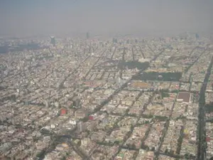
What causes pollution in the outside?
May 12, 26 12:44 AM
 The Hidden World of Pollution - Does the air you breathe have anything to do with a distant volcano or a dusty farm field? There's more to the gray haze
 -
UNDERWEAR AND POLLUTION
May 11, 26 12:12 AM
 Can Underwear Save the Earth? - What if your favorite pair of underwear were the only thing stopping a climate catastrophe? The hilarious truth about farts,
 -
Levi Mays Story about little boys
May 09, 26 07:06 PM
 The Secret History of Hot Air - Ever feel like there's more to what you see on the news? Get your detective gear on because we're diving into a world of
Do you have concerns about air pollution in your area??
Perhaps modelling air pollution will provide the answers to your question.
That is what I do on a full-time basis. Find out if it is necessary for your project.
Have your Say...
on the StuffintheAir facebook page
Other topics listed in these guides:
The Stuff-in-the-Air Site Map
And,
Thank you to my research and writing assistants, ChatGPT and WordTune, as well as Wombo and others for the images.
OpenAI's large-scale language generation model (and others provided by Google and Meta), helped generate this text. As soon as draft language is generated, the author reviews, edits, and revises it to their own liking and is responsible for the content.
Most Popular Pages on this Website:
Pictures of Global Warming
- See photos, cartoons, charts, graphs and a few surprises.
Clouds
- Don't know a cumulus from a stratus? Check here.
Causes of Global Warming
- It's not always obvious.
Calgary Alberta Weather
- Example of Canadian Goodness.
Thermometers
- Our favourite weather instrument.
- Home
- Contact Us
- Free E-zine Back Issues
- Privacy Policy
- Site Map - I'll help find something good.
By Barry Lough, P.Met., EP (Environmental Professional)
Text copyright © 2003-2024 Stuff in the Air.com
BACK TO TOP - Hit your 'Home' Key